Proposal:
“I intend to create a photo-story that documents Route 1, Iceland. The purpose of the project is to analyse how tourism photography inspires people to visit a place, and how this continues to drive the increase of the tourism industry. Route 1, the national road of Iceland, connects all of the tourist destinations across the island. Although many tourists don’t venture far past the capital region, this is part of my research to question why people travel to Iceland, and only concentrate their adventures on a small area of it. I will be addressing the differences between tourism photography, and professional landscape photography. I want to visit the majority of the tourist places on the widely available Route 1 map, weather depending.”
The idea for my initial proposal came from my passion for the Nordic countries, for both their landscape and values. After writing my Dissertation on the progression of Icelandic Art, I was interested in continuing with the theme of Iceland, to create an extensive research document on the country. I had visited Iceland before, and knew of its traditional landscapes, but also of its growing tourism scene. I wanted to research in to how a small country such as Iceland, has a rapidly growing tourism scene, although it is not seen as a typically desirable location to visit. It is evident all around that tourism is fuelled by photography, websites, magazines, blogs etc. as anything that is circled in the public domain is frequently recognised as truthful. Locations that are publicised in this way, are often promoted from their best angle, not showing other tourists to suggest a truly pure, idyllic location. This is what drives the industry, as often viewers think they will be visiting a location that is unique, and they will gain something, or photographic evidence, from the experience. As said ‘put your best foot forward’, tourists will more often than not present the best photograph they can of a location, even if the experience doesn’t match up to what they are showing through the media.
When I began researching in to Iceland specifically, I found the increase in tourists had been even more dramatic than I had expected. I began to think that as travelling becomes more common, people are now searching for different reasons to travel, and different aspects of the world to present to their friends and family to make them seem more cultured and adventurous. Iceland ticks these boxes, due to its unique waterfalls, landscapes, volcanoes, and drastic difference between winter and summer climates. It is the perfect place for someone to go and suggest they have now seen something you haven’t.
I knew I wanted to base my research on the increase of tourism in Iceland, and how it is the landscape that drives it. I had previously heard about Route 1, and knew it was the national road of Iceland, but had never searched the Route to see where it went and what was located on it. Its biggest competition is the Golden Circle, which is famous to all tourists as it is the quickest and easiest way to say you have ‘travelled Iceland’ and seen the three trademark locations on the island. It is a very popular day trip that almost all tourists that visit Iceland complete. Alongside this, the two next most popular locations are South Iceland, a long stretch of road that can take you to multiple spots such as rock formations, a glacier lagoon and an abundance of waterfalls, and Northern Lights trips.
The Northern Lights are a prominent tourist driving factor to Iceland, as it is a unique occurrence to the South and North Poles. I initially questioned creating a project on people that chase the Northern Lights, but due to the uncertainty of being able to view them, and the unpredictable weather in Iceland, I chose to pick a different central topic. I still hoped to see the Northern Lights, and prepared to photograph them in case I saw them, both for the project and as a personal bucket list topic. I felt if I captured them, it would add another level of depth to the project, as the photographs are a huge drawing in factor for readers.
I based my initial research on Route 1, finding out what was along the route, how to drive it and why tourists didn’t tent to venture around it. It quickly became evident that particular spots around the Route had been marked out for tourists, which had been focused on for anyone that travelled the road, but it wasn’t widely documented due to the sparsity of tourist locations in comparison to the South and Western region. I then began to look in to the difference between how tourists, and professional photographers would present these locations. Depending on the complexity of the landscape, the photographs could be very similar or dramatically different. For example, photographing Godafoss Waterfall in North Iceland, there are designated photographic locations where you stand, which means images from a phone, camera or any other source look very similar. But with the Northern Lights, there is a world of badly taken photographs online to view, with people stood in front of them, no focus on the images, or where they can hardly be seen at all through the grain of a low quality camera.
On google, there are plenty of reference maps to where the tourists ‘should’ go when they visit Iceland, such as the one attached. I decided that I wanted to visit all the of attached locations, or as many as I could, to make a document on the truth behind the photographs used in the tourism industry, and discuss why tourists take the routes they do, and how this is influenced through the media.
I planned to go to Iceland for 7 days, 20thFebruary 2018 – 27thFebruary 2018. Flying from Bristol, where I am located, made the airport easy access for me. I prepared by hiring a rental car from the Airport in Keflavik, Iceland, which I would return to the airport at the end of the week. I chose to hire a car for ease of access, from the research I had done, renting a car for private travels was a much more unique experience than travelling on tour buses, which is a popular way to travel around in Iceland. I feel many tourists are put off by the icy roads, so put their trust in someone else to drive for them. I made a simple route plan, that took me clockwise around the island.
On the route, I made a decision to include the Snæfellsnes Peninsula, although it is not on Route 1. I made this choice due to it being a popular tourist route due to its location close to Reykjavik, and I felt I would be missing out an important part of the industry in Iceland if I didn’t take the road around the Peninsula. I didn’t make a decision of what tourist destinations I definitely wanted to visit on the route, because I knew the weather would be unpredictable at this time of year, which could alter my travel plans daily. I wanted the trip to flow, and not be under pressure to document any specific area at one time, as often the light or weather may not be appropriate.
Before my trip to Iceland, I didn’t have many expectations of what my project would look like. I had never taken the road before, and was fully aware it may not live up to the photographs that I had seen. But I was excited for the journey, as a tourist myself, I was keen to visit all the places on the map, but also experience the culture outside of the tourist areas by staying in random locations on the route. When I arrived in Iceland, the weather was just as unpredictably dramatic as I thought it may be, with heavy snow storms and clear blue sky’s both in 10 minute intervals. This made the photographic conditions often difficult to work in, as it was a constant battle with the weather, often in harsh wind or snow that could easily blow you down or damage your camera, which was particularly bad by the coast. As Route 1 is predominantly around the coast of Iceland, it was often the strong winds coming off the North Atlantic. This also caused interference with driving around the route, as we did not have a 4×4, we occasionally struggled with the strong winds and had to stop the car as you could see the front of your own car through the heavy snow. But we managed to stay safe, with the help of the road.is website, that saved our journeys by showing live updates of road closures, heavy winds etc.
I was pleased with the different tourism levels I experienced when travelling Iceland, as it gave me a varied experiences to document and reflect on around Iceland. I felt my trip was very representative of the tourism industry in Iceland, as naturally the North and East were very quiet locations, and the South was full of tour buses. This allowed me to evaluate how these areas are presented to tourists through websites and even within Iceland, using material such as brochures to promote tours to see the Northern Lights, the Golden Circle and South Iceland.
Before I left, I wasn’t sure on what photographic style I wanted to use to document the locations. I was torn between presenting the landscapes with people in to show what the locations are really like, or to photograph them as people would want to see them. I feel my photographic technique came naturally, wanting to present the landscapes in their best forms. It became apparent to me that the tourists did not make the landscape any less unique, although they may interfere and in the future affect the landscape itself, they were there to view the landscape. I wanted to present what people could see, not to degrade the landscape by showing the crowds of people. Also, some of the locations in the North, only had a few other bunches of people around, so I these photographs would of looked more ‘idyllic’ to the viewer as there is less people, which would create a counteractive context, as these areas would then be desirable to visit to capture the photography and feel like you have been somewhere others have not yet.
So I used the traditional landscape photographic style, using the best or appropriate vantage points for the areas I documented, focusing on the location itself. I also documented many photographs of the road. I was surprised how much of the drive is actually through nothing, and this was often the best bit of the trip. Driving through Iceland, with nothing around you for hours on end, really is my idea of idyllic, which is presented through the photographs of the road. I feel these are also important to add to the project, as driving is such a huge part of the journey, this needs to be incorporated through the imagery and text.
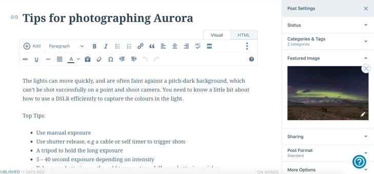
I am pleased with the quality of images that I captured, as I definitely tested my landscape skills through the weather, and limited light. With only 4-5hours of proper day light per day, I often struggled with exposure due to the low light being combined with heavy clouds. Also, photographing the Northern Lights was a big experience for me, as I feel this is something you cannot fully prepare for. They take you by surprise, and do move quickly and differ in intensity through the sky, so I see why people set up in locations and wait all night for the ‘perfect’ image, but we were lucky enough to catch them whilst driving through East Iceland where there is low light pollution due to the limited people living or travelling here, within the mountain ranges by the coast.
In my final project, I used a combination of camera images, and phone images. I didn’t expect to use any phone images in my project, but due to the photographic conditions, using an iPhone 10 on HDR occasionally provided better settings for the images. I would have had to take long exposures of a still frame to get the light in, and the iPhone could collect these shadows itself in a single frame. This was also appropriate when I took snap shots of locations such as the plane, when I couldn’t access my camera or thought the shot wouldn’t be appropriate. This is another good point about making a magazine, as some images can be placed in small placeholders and therefore do not need to be shot on camera, as they are not being blown up to a large scale. This also raised questions to me about tourists taking professional photographs, as now most people have a high quality camera on their phone, landscape images are being circulated more widely between people that do not intend to take professional images. This also blurs the lines between tourist photograph and landscape photography, as often all the elements now blend together when travelling.
I found that the editing process of the photographs was a key part before choosing, or presenting any imagery. This is because of the huge contrasts between black and white in my images. Often the snow would dominate the frame, which sometimes has no texture or detailing, contrasting against black rocks or mountains, so the levels were difficult to control. Also lifting shadows in the darker areas, or bringing down the highlights when the frame was exposed to complement one or the other. This was the longest part of the whole process, as I had to focus time on each image to ensure the final composition was high quality, and complementary to the landscape. Editing the photographs of the Northern Lights was another challenge, ensuring the lights came through the image, but were not over saturated or too bright, which can easily look very unrealistic.
I found that after the trip, I had to distance myself from the work itself for a few weeks. I found myself heavily influenced by my own personal experiences when doing image selection or thinking about writing text, which would alter the project. I focused on editing the images during this time, and how to present the work, instead of creating any work. This was the best option, as when I came back to choosing images to put in to the project and the accompanying text, I could reflect back and focus on Iceland as a landscape and trip, instead of my personal influences.
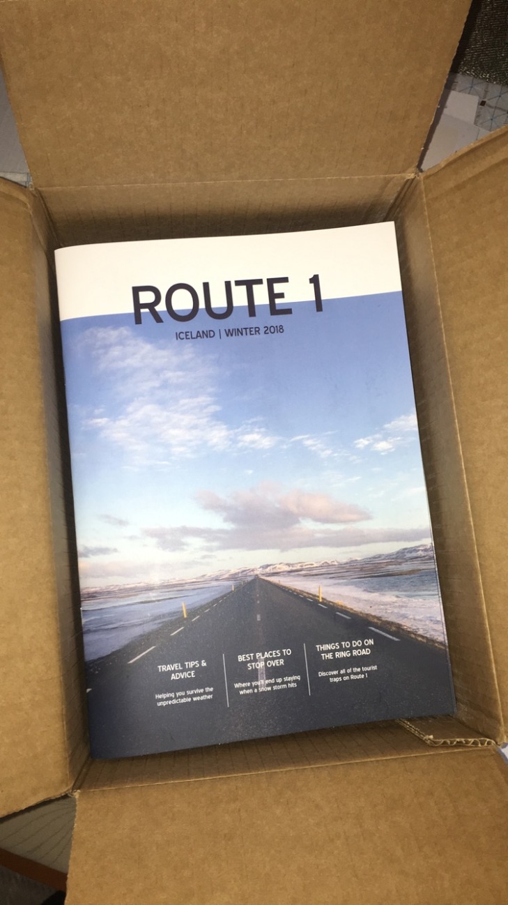
Although I looked at different ways of presenting, I am pleased with my choice of creating a magazine and a website. I feel due to the context of my writing, and wanting to present my images high quality, the magazine was the best size and structure to combine the two. I feel it really complements the photographic style, due to the professional paper type and matt finish. I feel the magazine influences that I found when researching travel magazines, strongly contributed to helping me create a professional looking magazine. It presented me with alternative lay outs and title formats that I would not normally use, which was good to push me out of my comfort zone. As I normally make books, this was the first magazine I have created, and I am pleased at how I pushed my own creative boundaries. I am used to setting lay outs for a book where the pages are similar, but here I had to work to the strengths of the image boundaries and context to go with them, instead of the lay out itself.
Linking the magazine to the website offers an alternative viewing platform, which is easily accessible to a wider range of viewers. I am pleased with the format of the website, which entices readers to ‘read more’ from previews of the posts, combined with idyllic images to make you click on the location. I feel the magazine and website work in harmony, but provide different lay outs to target different types of researchers.
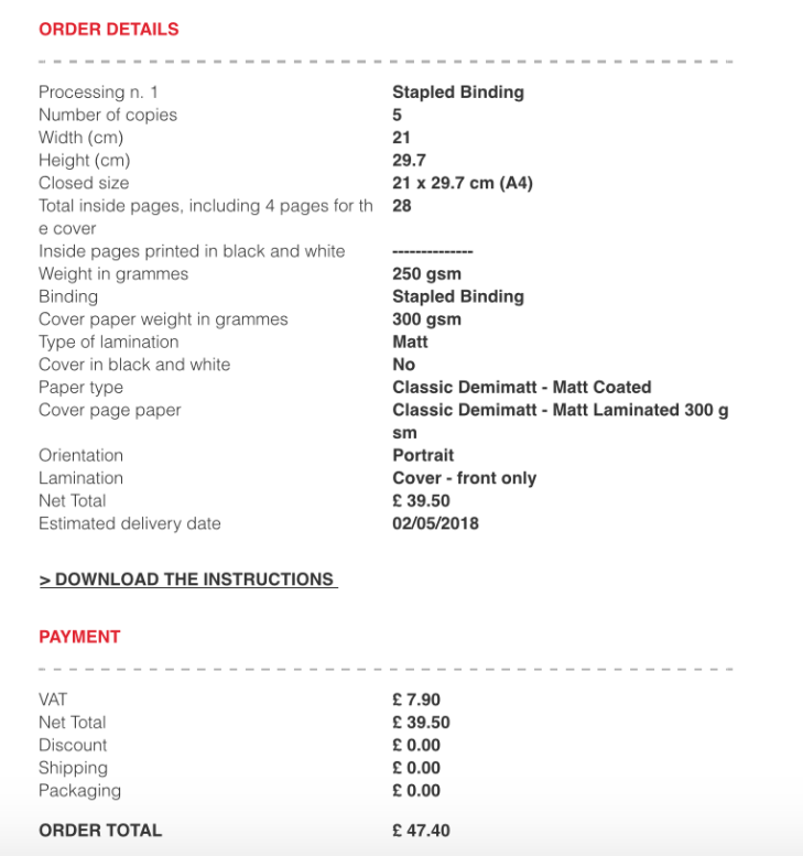
Pixart printing was a great site to get my magazine printed on, with all the different paper options, finishing options and custom sizes. I would recommend the site, and definitely use it again. Matt was the best choice for my magazine, I am pleased with how the images look high quality without having a sheen on. The only image I had a problem with, is the second Aurora image, which was a difficult image as it has very dark tones and colours within the sky. Due to the crop, some of my text has fallen in to the fold due to the paper thickness, or off the sides, but this is something I should had considered prior to printing. I didn’t think about how the paper thickness would increase the fold and therefore pull the pages in, which is something I have learnt for next time I use Pixart for printing.
My target audience was people of any gender between 20-35years old, travelling on a low-medium low budget. I feel my project meets this audience, due to its casual language, truthful comments, travelling facts and photographic quality. People of this age range are often motivated by photography, as they are prone to using technology in which advertising is subconsciously consumed through photography and marketing techniques. So when seeing a location that is unusual to them, but presented in an idyllic way, they are automatically driven to wanting to find out more about that place. They are then settled by reading something that does not intimidate, or use heavy language, and are informed of the road trip. Not using the normal descriptive terms such as ‘magical landscape’, steers people in to reading the text in a different way. They begin to read almost as a journal, as a conversation instead of like they are being told something, which is the approach I was going for.
I feel letting the project flow naturally was the best approach I could have taken. I think over planning, would’ve altered the project to be static, or seem not as natural. Allowing myself to push boundaries when both travelling, and with my photographic skills, was the best thing for myself and the project. The outcome of the work presents a travel guide, that looks at travelling Route 1, with the intent to inspire, without giving unrealistic views. I am surprised at how Route 1 became more of a brand statement, that has been continued through the different elements of the project. As the project focuses on different elements of tourism and research, Route 1 became a heading with various subtitles, instead of a heading that focuses on that particular subject. I did not expect this to come from my work, but I am pleased that it acts as a platform to tie all of my research together.
Overall, I am pleased with how I researched, travelled and the quality of my final work. If I was to add to the project, I would have possibly create a travel video, which could have been embedded in to my blog. But as I intend to continue with this project for a summer version, this is something I could progress on in the future. The project is good for the target audience, including the photographic style and language used inside. Both elements of the magazine and website are easily accessible, and focus on the matter which I raised in my proposal. I think my intentions progressed as my research did, moving from how tourism is increasing, to how the media is one of the primary sources of driving the industry.


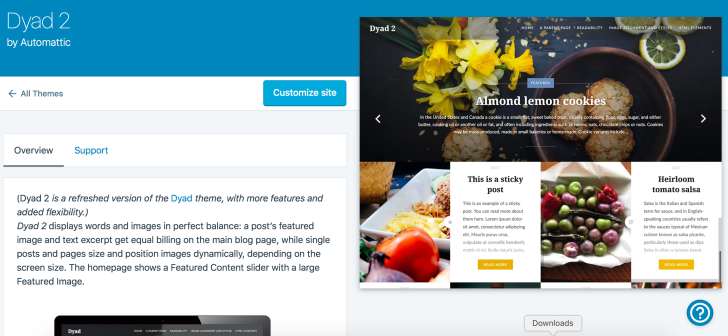
 I created my website on the base of the theme ‘Dyad 2’. It is important to let the right theme for what you are presenting, to meet the right target market and for it to be easy for your readers to navigate around. I chose Dyad due to its simplistic blog post lay out, that complements text by contrasting white text boxes against photographs. Although there is the option to have a scrolling header in this theme, I have chosen to stay with the static header that mirrors my magazine front cover. I also changed aspects of the theme, such as the colour scheme, to the blue palette. I chose to do this to reflect on the blue tones in Iceland as a country, which are used in many representations of Iceland. This changes areas such as the ‘read more’ button to blue instead of their signature yellow, which complements what I am presenting better.
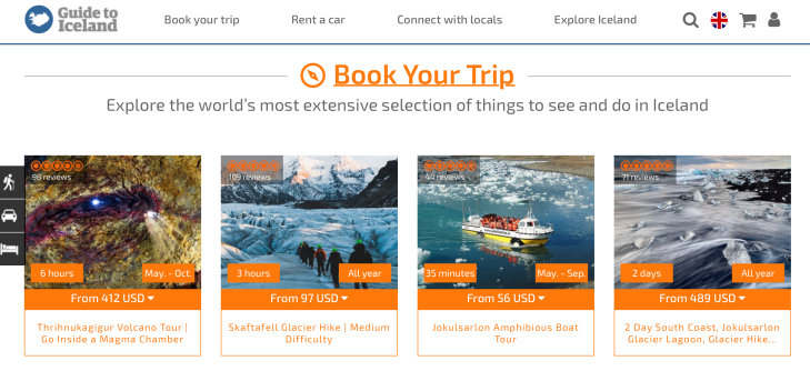
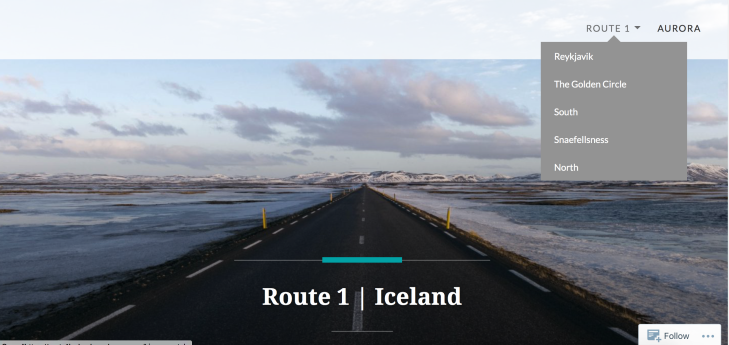 When you scroll down the homepage, the blog posts come up in this format:
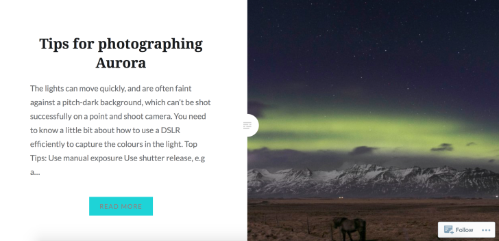
 At the bottom of the blog posts, the previous post & next post links are generate to fuel continued interaction with the website. This is helpful to get people to keep looking at blog posts when they have finished the one they have reading which increases readership.
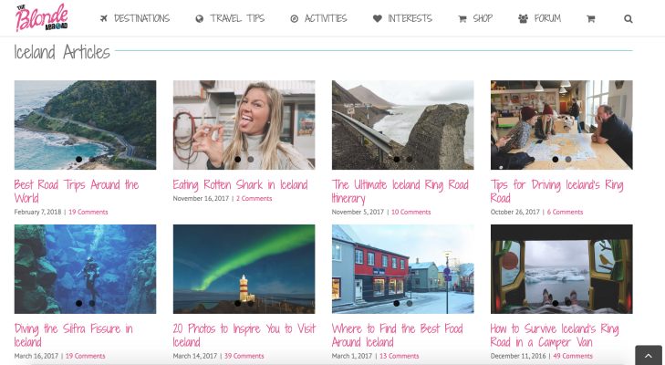
 Miss Tourist, uses a long page view where you scroll down through the pages. But strangely, each Day only has this much writing (shown) and occasionally the words link out to separate pages for areas. I find this confusing, as there is no clear lay out to find information. It is more a journal for the blogger, instead of a way of showing different cultures and sources to the reader.
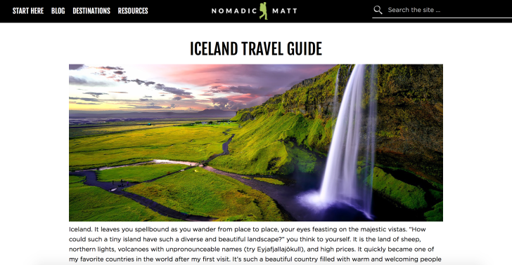

 The website includes key articles such as typical costs, and budget tips, which are important for all genres of people to learn about to get the most from their trip. The language used is easy to read, as it talks in first person, about the writers experience. They answer questions that maybe they thought before they went, which makes you feel connected with the site and trust the experiences of the person writing it.
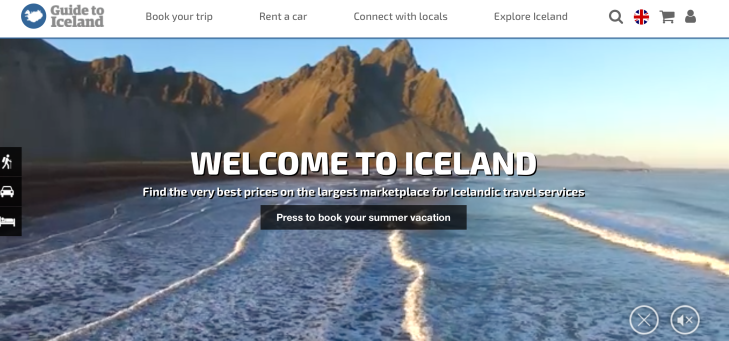
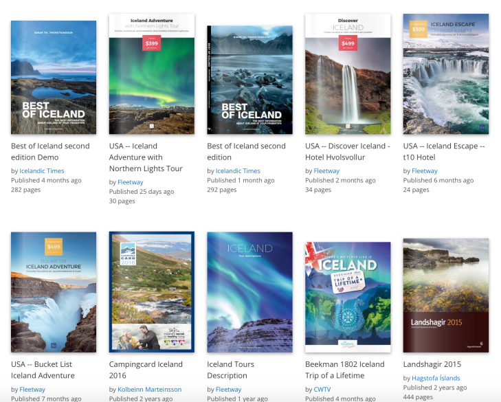
 Issuu is a publishing website that has 100million unique viewers per month. It is a free site where people can upload their publications, with over 30million publications uploaded on to their site.